Posts

first of the first?

Today is the first anniversary of moving into our passive house... bittersweet to the data keen as we didn't have internet working well enough to log data effectively for another couple months (so we still don't have a year worth of data)... and solar installed for a few more months after that... and then not actually generating power for a few more. We still don't have the final occupancy certificiate, as we still have not yet fully realised the landscape plan (although the back yard grass was seeded three weeks ago and it has a noticeable green-ness to it). All in due time! Of course the National Broadband Network and solar did get installed and eventually even activated. The workbench in the garage and the bench seat in the front entry were built out of timber salvaged from the old house... and both are fit for purpose. We have made a lot of progress on the landscaping (a pallet plus of geohex was installed, lots of tons of wood chips and sandstone gravel have been place...

Sustainable house day 2020

 Another event turns virtual... We pushed to unpack in time for sustainable house day in 2019, but the 2020 Sustainable House Day will be online . We've got a video in the can with the help of Andy Marlow and video editing expertise volunteered through Renew . Rumour on the street is that we will be participating in a Zoom session on "Passive House (Passiv Haus) Principles" from 17:00 – 17:45 (AEST) 20/09/2020 (Sustainable House Day).

Heating & power usage...

Image
Heating - how much do we use / need in our house? A simple question, but there are many ways to look at it. I've taken a fairly simplistic. I've used linear models to estimate the effect of temperature on energy usage. The graphical representation of the relation between temperature and energy usage is below...  Some key take aways for people not used to reading graphs: The vertical (y-axis) is daily energy consumption in kilowatts. The horizontal (x-axis) is temperature (in this case it is the running mean operating temperature [RMOT] recorded by the HRV). The dots are 160 individual days - each with a corresponding RMOT and energy consumption reading. The black line is straight and declining - indicating that energy use decreases as temperature increases. In fact for every degree colder we use an extra 0.5kW (this is the slope of the black line). The grey area encompasses 95% of the variation and there is considerable variation. Temperature explains ~ 39% of ...

2020 July

Another month of house data... The weather was down right cold, with some decent rainfall towards the end of the month. Of course the big news this month was still COVID-19 (2 adults working from home except for a couple of days), but the kids were at school half the month due to the winter school holidays. We have run the heater a fair bit to bring the house temperature up just a bit. We were using the ERV core all month as our part of data collection on the two cores in the Sydney climate. Percentage of hours in below, within, above the 20 - 25 °C target temperature range for the month. Inside / Outside % < 20 °C % 20 - 25 °C % > 25 °C Inside 14% 86% 0% Outside 100% 0% 0% Methods: I have taken the 5 minutely data from the wirelessTag sensors and calculated the median temperature of each sensor for each hour and determined the proportion of hours falling inside of the 20 - 25 °C target temperature (using the R functions 'aggregate' and 'hist')...

Water update...

Image
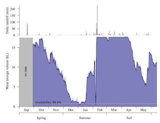
We've recieved three water bills since moving in (how time flies)... for about half that time we have been working from home and even had the kids at home for six weeks. Even with all that we've done really well.  City water: the quarterly bill from the "old normal" was 172L/day, the lock down quarter was 198L/day, and the working from home quarter was 180L/day. So not too much variance really, and 183L/day over three quarters is good and puts us at 46L per person per day... about 20% of the typical Sydney resident.  Rain water: Since moving in we have been able to supply our laundry, toilet and garden needs for all but one week in January... without having to water some of the new plants we probably could have made it 100% on rain water for those needs. I plotted rain fall (from the NetAtmo rain gauge which is excellent) and water level in the rain water tank (using a Vegetronix AquaPlumb sensor, which the individual measurements (hou...

Winter sun videos...

It took many more tries than I care to admit, but I finally managed to put the GoPro on the tripod to capture some timelapse photos capturing the performance of the fixed shading on the exterior of the house as well as the sunlight coming in through the water tanks across the day. 1. Outside - sun on the northern face of the house . 2. Inside sun on the translucent tubes .

2020 June

Another month of house data... The weather is getting down right cold, with lots of modest rainfall. Of course the big news this month was still COVID-19 (2 adults working from home except for a couple of days towards the end of the month), but the kids were back to school all month. We have even run the heater a fair bit to bring the house temperature up just a bit. We were using the ERV core all month as our part of data collection on the two cores in the Sydney climate. Percentage of hours in below, within, above the 20 - 25 °C target temperature range for the month. Inside / Outside % < 20 °C % 20 - 25 °C % > 25 °C Inside 14% 85% 1% Outside 100% 0% 0% Methods: I have taken the 5 minutely data from the wirelessTag sensors and calculated the median temperature of each sensor for each hour and determined the proportion of hours falling inside of the 20 - 25 °C target temperature (using the R functions 'aggregate' and 'hist'). Inside includ...