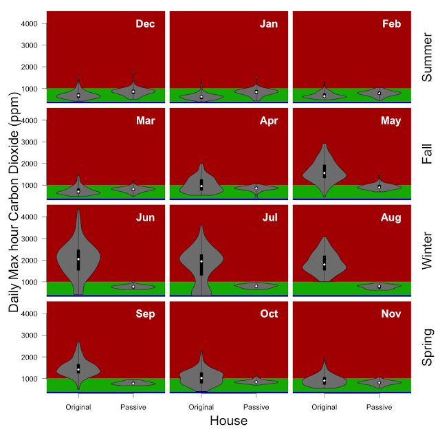
2022 Aug + Winter
August was cold (average of 13 °C, the coldest hour was 4 °C, and warmest hour was 24 °C). The split system was on (set to 23 °C during our typical winter solar generation period (10:00 am - 3:30pm), mostly on 20 °C overnight (9pm - 6am), and off during the peak periods) and the HRV was solidly in 'heating' season all month. We had a couple people isolating for a couple weeks, but otherwise life was normal.
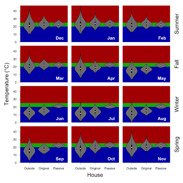
Over the last couple months I've had a few conversations with folks from Better Renting and subsequently I've been looking at the WHO Housing and health guidelines. I am not sure why Passive House decided on 20 - 25 °C as their temperature range. WHO has set 18 °C as the recommended lower threashold temperature in winter months. I'll confess that when my house is over 24 °C in the winter months it can feel really warm, whereas in the summer indoor temperatures up to 26 or even 27 °C can feel quite comfortable. Especially over night winter temperatures much over 21 or 22 °C can feel quite warm.
Temperature from inside and outside the house as the percentage of hours in 0.5 °C bins. I've scaled the temperature in hope that I will be able to use the same axes for all months.

Methods: I have taken the 5 minutely data from the wirelessTag sensors and calculated the median temperature for each hour and determined the proportion of hours falling inside of the 20 - 25 °C target temperature (using the R functions 'aggregate' and 'hist'). Inside includes data from the wirelessTag sensors spread across nearly every room of the house. Outside is the data from the wirelessTag sensors outside near the cubby house and HRV intake. The water wall and door data are not included.
Energy production and consumption: 1. total daily consumption daily energy production, 2. daily net energy production, and 3. energy independence (which is the percentage of our daily consumption that is met directly by our solar panels).

Methods: Data are taken from the Enphase Enlighten system. This reports solar generation and electricity consumption as well as import from and export to the grid in 15 minute intervals. The R function 'aggregate' is used to create daily values and the function 'vioplot' to create the plots. The plots show individual days as points, with the vertical black bar covering the middle 50% of the data, the big white circle is the middle of the data (median), the whiskers extend to the farthest points from the median that are not more than 1.5 times the interquartile range, and the grey 'violin' shows the distribution of the datapoints where the narrow portions indicates few datapoints and a wide portion indicates more commonly occurrence... much like a histogram.
Temperatures for the 2022 Australian winter (months of June, July, August) using the same methods, but with the WHO healthy housing guidelines shown. I had to add a decimal point for the WHO guidance statistics so that it didn't round to 100%. Electrical usage and production as well... a very wet winter (and year) means that solar production is down.