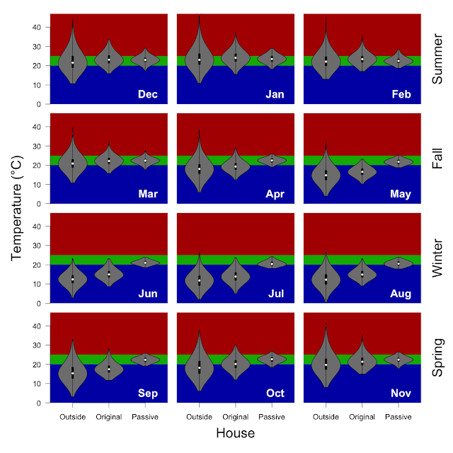
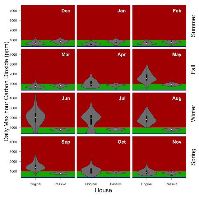
a year of temperature in graphs...
You know it is bad when your architect says that the tables are not very good, but Andy was right - the graphs are way better than the tables. In looking at it I realised that I really needed to do it seasonanally (and monthly). This uses the same data as I have posted previously for sustainable house day...
I am not sure why the plots look so bad here, but if you click on them the larger files look okay... (how about letting me use (svg?)
Outside (green) and inside (blue) with 20 - 25 °C lines indicated. All of the x-axes (Temperature) span the same range, but the y-axis range (proportion of hours in 0.5 °C bins) varies.


