Carbon dioxide (Old vs. New)
I one of the things I've noticed is the carbon dioxide levels in our passive house compared to our old house which had plenty of draughts but no ventilation aside from a bathroom exhaust fan. So I've used the NetAtmo carbon dioxide data collected every 5 minutes since October 2012 to quantifiy the differences. I only have a single sensor located in the respective living room of each house. I averaged the raw measurements to get hourly averages. Because I most interested in peak carbon dioxide - I've taken the maximum hourly average for each day. This ends up being 2,192 days from the original house, 615 days from the passive house. I've left the rental house out of this comparison, but it was disturbing like the original house despite being ~ 20 years old.
By way of standards: 420ppm is typical CO2 level outside, less than ~ 1000ppm is considered to be good, levels greater than 2000ppm are often associated with headaches and drowsiness.
The key take-home messages:
- The passive house has much more acceptable carbon dioxide levels than the original house (only very rarely above 1000ppm).
- In the summer the median CO2 (white dot) is the same across all of them... benefits of open windows in the old house
- In the winter (or whenever the windows were close) the original house CO2 levels spiked, and on a typical winter day a CO2 level higher 2000ppm happened close to half the days.

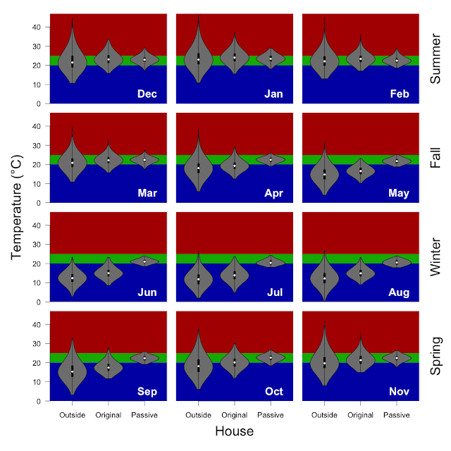
In the the figure above. Each panel is data from one month of the year (labeled in white in the lower right corner of the plot) and each row corresponds to an Australian season (Summer at the top to Spring at the bottom, labeled on the right hand side of the figure). Each panel is plot with carbon dioxide on the y-axis (vertical) broken into two categories 'original house', 'passive house' (left to right). The red background corresponds to CO2 levels over 1000, and the green is the Goldilocks zone (400 - 1000 ppm). The violin plots in the middle are essentially histograms with the width of the violin corresponding to the number of measurements at that ppm CO2. The black bar in the middle of the violin plot shows the span of 50% of the measurements and the white dot is the median value (half of the CO2 ppm are higher and half of the CO2 ppm are lower.