Temperature (Out vs. Old vs. New)
I have fielded more than a few questions about the temperature of our passive house versus the temperature of the house that we lived in prior (on the same lot). So I've used the data I had on hand which is temperature (°C) recorded every 5 minutes over since October 2012. For the sake of consistency I am only using the NetAtmo sensors that I have had for that entire period. So I only have one outside sensor and one inside sensor located in the the respective living room. The outside sensor moved around a bit, but it should be good enough. I've converted those measurements to hourly averages. This ends up being ~ 66,955 hours to play with (52,232 hours from the original house, 14,723 hours from the passive house). I've left the rental house out of this comparison, but it was disturbing like the original house despite being ~ 20 years old.
The key take-home messages:
- The passive house a much less variation in temperature than the original house (or outside).
- In the summer the median temperature (white dot) is the same across all of them, it is the reduced variation with more nice with less too hot or too cold that makes it pleasant to live in. [aside: I would consider Dec-Mar to be thermal summer based on these data.]
- In the winter the passive house is actually comfortable whereas the old house was just cold... and looking at the data winter is really from May through September! In our old house the temperature in our living room was above 20 °C for only ~ 25% of the hours (and those would have been the hours we were at work or when the space heater was on).

In the the figure above. Each panel is data from one month of the year (labeled in white in the lower right corner of the plot) and each row corresponds to an Australian season (Summer at the top to Spring at the bottom, labeled on the right hand side of the figure). Each panel is plot with temperature on the y-axis (vertical) broken into three categories 'outside', 'original house', 'passive house' (left to right). The red background corresponds to temperatures greater than 25 °C, the blue background corresponds to temperatures less than 20 °C, and the green is the Goldilocks zone (20 - 25 °C). The violin plots in the middle are essentially histograms with the width of the violin corresponding to the number of measurements at that temperature. The black bar in the middle of the violin plot shows the span of 50% of the measurements and the white dot is the median value (half of the temperatures are higher and half of the temperatures are lower.
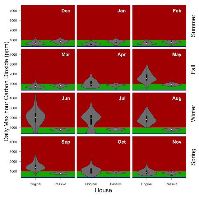
(Carbon dioxide in the next post)